Important this week
The midpoint arrives with bigger movement, stronger milestones, and a clearer sense of your baby's growth.
Single-page information site
Fetal is designed as one calm place for tracking, planning, and the little moments in between. This page turns the Android app into a polished, scrollable overview of its experience.
The midpoint arrives with bigger movement, stronger milestones, and a clearer sense of your baby's growth.
The visual language keeps the app feminine and calm without becoming noisy, making it feel more trustworthy and restful.
The core experience revolves around a week tracker, then opens into reminders, counters, names, zodiac, and playful prediction tools.
This site is intentionally non-personalized. It presents the app's modules, tone, and week-by-week storytelling as a clean informational experience.
Week by week
The Android app already carries rich pregnancy content. Here, that same tone is reshaped into a more editorial browsing experience with milestone imagery and short, readable summaries.
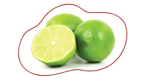
Your baby is around 1.5 inches long this week and, in the app, is described as being as big as a lime. The tone stays practical, reassuring, and easy to scan.


Week 20 is one of the strongest content beats in the app: the midpoint of development, more movement, and a shift toward bigger visible milestones.

Late pregnancy content focuses on staying calm, breathing through contractions, and understanding that the baby is fully developed and ready.
Modules
The navigation drawer in the Android app opens into a surprisingly wide set of supportive tools. The informational site keeps them visible as a clean module grid.
Track the pregnancy journey with milestone visuals, descriptive weekly guidance, and a signature circular progress view.
Framed as the first step into the app, this module personalizes the timeline and sets the emotional tone for the rest of the experience.
Appointments, pills, and notes are organized into calm cards that feel more like a wellness planner than a clinical utility screen.
A focused companion module for movement sessions, designed to feel clear, quick, and supportive when attention needs to stay on the moment.
Timing support and session history become part of the broader pregnancy toolkit rather than being treated as a separate clinical product.
Explore the Chinese baby gender predictor with a traditional calendar-style presentation that stays playful and visually lightweight.
Estimate your baby's possible blood group through a guided, more readable predictor built around clear parent selections.
Pick each parent's eye color to preview likely outcomes through a softer, friendlier interpretation of a genetics-style chart.
Switch categories, browse meanings, and keep favorites in a discovery flow that expands the app beyond tracking into daydreaming and planning.
Browse each sign through playful traits and personality notes, giving the product a lighter, more personality-led browsing mode.
Showcase
Rather than feeling like unrelated mini-apps, these features can be presented as one family of cards, panels, and softly framed content blocks.


The goal is not to make these features feel medically authoritative. The site presents them as light, curiosity-driven companion tools within the broader pregnancy experience.


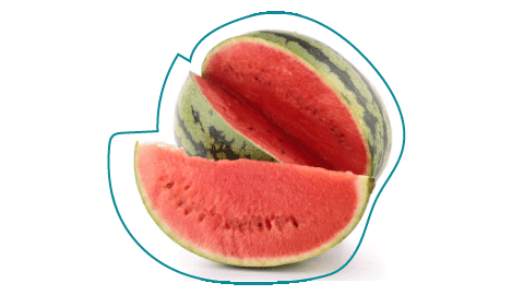
These visual comparisons are part of what makes the app warm and memorable, so the information site keeps them close to the written milestones.
The single-page format shifts the product from setup and interaction into presentation and understanding. Each section explains what the app offers, how it feels, and why the visual direction matters.
Design direction
The site follows the same direction already explored in your design mockups: a lighter background, stronger hierarchy, softer shapes, and card layouts that feel more editorial than utilitarian.
Airy gradients and blurred organic shapes reduce visual noise and make the content feel lighter.
A softer serif headline paired with a friendly rounded sans voice makes the page feel more premium and less template-driven.
Rounded surfaces, subtle borders, and layered shadows mirror the Android app's updated card language without copying it too literally.
The informational site explains the product clearly while keeping the warmth and emotional support that already exists in the app copy.